MJML Guide
MJML (Mailjet Markup Language) is a markup language designed to reduce the pain of coding a responsive email.
Its semantic syntax makes it easy and straightforward whilst its rich standard components library speeds up your development time and lightens your email codebase.
MJML’s open-source engine generates high quality responsive HTML compliant with best practices.
Overview
MJML rolls up all of what Mailjet has learned about HTML email design and abstracts the whole layer of complexity related to responsive email design.
Get your speed and productivity boosted with MJML’s semantic syntax. Say goodbye to endless HTML table nesting or email client specific CSS. Building a responsive email is super easy with tags such as <mj-section> and <mj-column>.
MJML has been designed with responsiveness in mind. The abstraction it offers guarantee that you will always be up-to-date with the industry practices.
Email clients update their specs and requirements regularly, but we geek about that stuff - we’ll stay on top of it so you can spend less time reading up on latest email client updates and more time designing beautiful emails.
<mjml>
  <mj-body>
    <mj-section>
      <mj-column>
        <mj-image
          width="100px"
          src="https://mjml.io/assets/img/logo-small.png"
        ></mj-image>
        <mj-divider border-color="#F45E43"></mj-divider>
        <mj-text font-size="20px" color="#F45E43" font-family="helvetica"
          >Hello World</mj-text
        >
      </mj-column>
    </mj-section>
  </mj-body>
</mjml>
Installation
You can install MJML with NPM to use it with NodeJS or the Command Line Interface. If you're not sure what those are, head over to Usage for other ways to use MJML.
npm install mjml
Development
To work on MJML, make changes and create merge requests, download and install yarn for easy development.
git clone https://github.com/mjmlio/mjml.git && cd mjml
yarn
yarn build
You can also run yarn build:watch to rebuild the package as you code.
Usage
Online
Don't want to install anything? Use the free online editor!

Applications and plugins
MJML comes with an ecosystem of tools and plugins, check out:
- The MJML App (MJML is included)
- Visual Studio Code plugin (MJML is included)
- Sublime Text plugin (MJML needs to be installed separately)
For more information, check the Tooling section.
For more tools, check the Community page.
Command line interface
Compiles the file and outputs the HTML generated in
output.html
mjml input.mjml -o output.html
You can pass optional arguments to the CLI and combine them.
| argument | description | default value |
|---|---|---|
mjml -m [input] |
Migrates a v3 MJML file to the v4 syntax | |
mjml [input] -o [output] |
Writes the output to [output] | |
mjml [input] -s |
Writes the output to stdout |
|
mjml [input] -s --noStdoutFileComment |
Writes the output to stdout without an comment containing the source file in the first line |
the outputs first line contains the file in the format <!-- FILE: {filename} --> |
mjml -w [input] |
Watches the changes made to [input] (file or folder) |
|
mjml [input] --config.beautify |
Beautifies the output (true or false) |
true |
mjml [input] --config.minify |
Minifies the output (true or false) |
false |
mjml [input] --config.juicePreserveTags |
Preserve some tags when inlining css, see mjml-cli documentation for more info | |
mjml [input] --config.minifyOptions |
Options for html minifier, see mjml-cli documentation for more info | |
mjml [input] --config.mjmlConfigPath [mjmlconfigPath] |
Uses the .mjmlconfig file in the specified path or directory to include custom components |
The .mjmlconfig file in the current working directory, if any |
mjml [input] --config.useMjmlConfigOptions |
Allows to use the options attribute from .mjmlconfig file |
false |
mjml [input] --config.validationLevel |
Validation level: strict, soft or skip |
soft |
Inside Node.js
import mjml2html from 'mjml'

/*
  Compile an mjml string
*/
const htmlOutput = mjml2html(
  `
  <mjml>
    <mj-body>
      <mj-section>
        <mj-column>
          <mj-text>
            Hello World!
          </mj-text>
        </mj-column>
      </mj-section>
    </mj-body>
  </mjml>
`,
  options,
)

/*
  Print the responsive HTML generated and MJML errors if any
*/
console.log(htmlOutput)
You can pass optional options as an object to the mjml2html function:
| option | accepts | description | default value |
|---|---|---|---|
| fonts | object | Default fonts imported in the HTML rendered by MJML | See in index.js |
| keepComments | boolean | Option to keep comments in the HTML output | true |
| beautify | boolean | Option to beautify the HTML output | false |
| minify | boolean | Option to minify the HTML output | false |
| validationLevel | string | Available values for the validator: strict soft skip |
soft |
| filePath | string | Full path of the specified file to use when resolving paths from mj-include components |
. |
| mjmlConfigPath | string | The path or directory of the .mjmlconfig file |
process.cwd() |
| useMjmlConfigOptions | boolean | Allows to use the options attribute from .mjmlconfig file |
false |
| minifyOptions | object | Options for HTML minifier, see mjml-cli documentation for more info | {"collapseWhitespace": true, "minifyCss": false, "removeEmptyAttributes": true} minifyCss can take a value of false or one of the two preset options lite or default. Within either preset, you can specify specific options from cssnano, for example minifyCss: { options: { preset: [ 'default', { minifyFontValues: { removeQuotes: false }, }, ], }, }, |
| juicePreserveTags | boolean | Optional setting when inlining CSS, see mjml-cli documentation for more info |
API
A free-to-use MJML API is available to make it easy to integrate MJML in your application. Head over here to learn more about the API.
Getting Started
This is a responsive email:
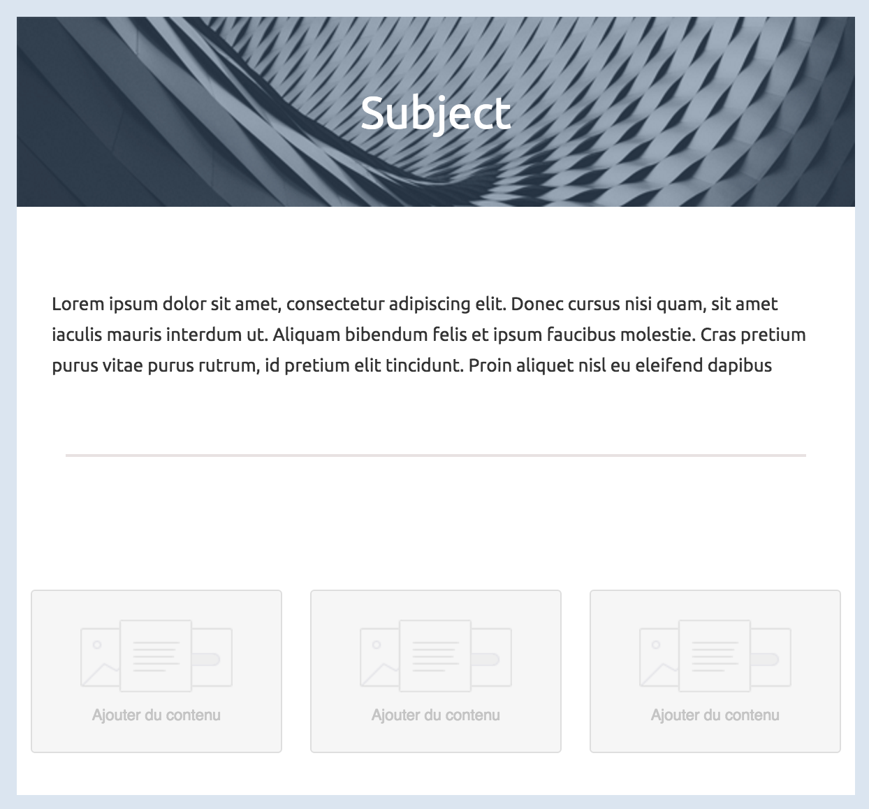
Like a regular HTML template, we can split this one into different parts to fit in a grid.
The body of your email, represented by the mj-body tag contains the entire content of your document:
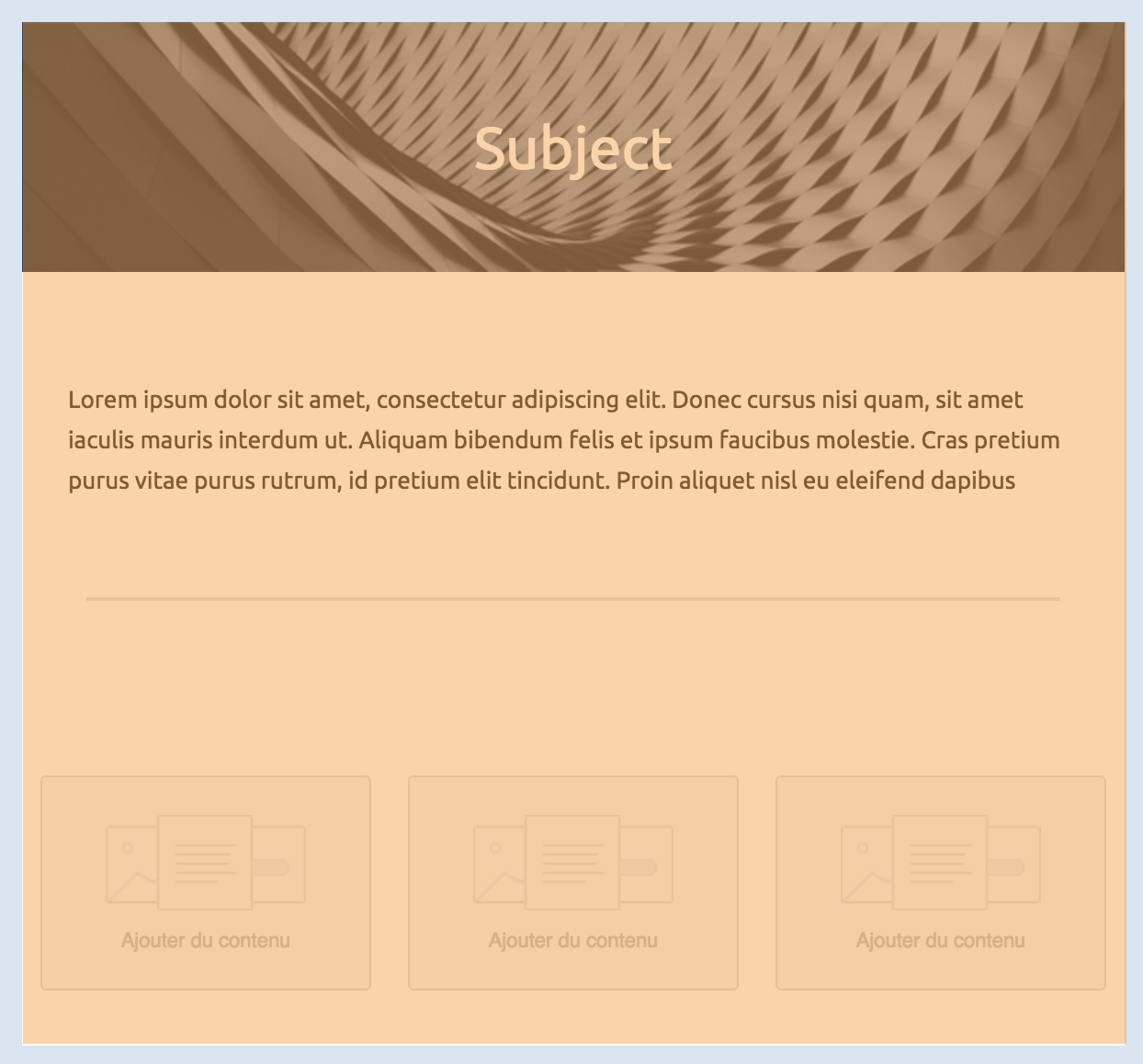
From here, you can first define your sections:
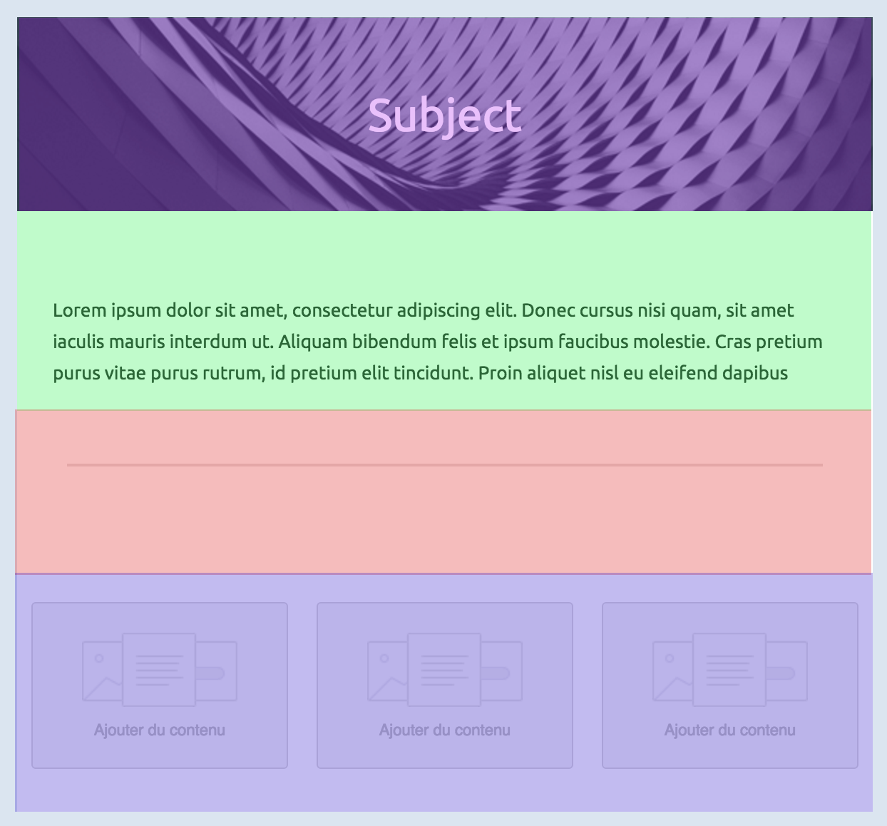
Inside any section, there should be columns (even if you need only one column). Columns are what makes MJML responsive.
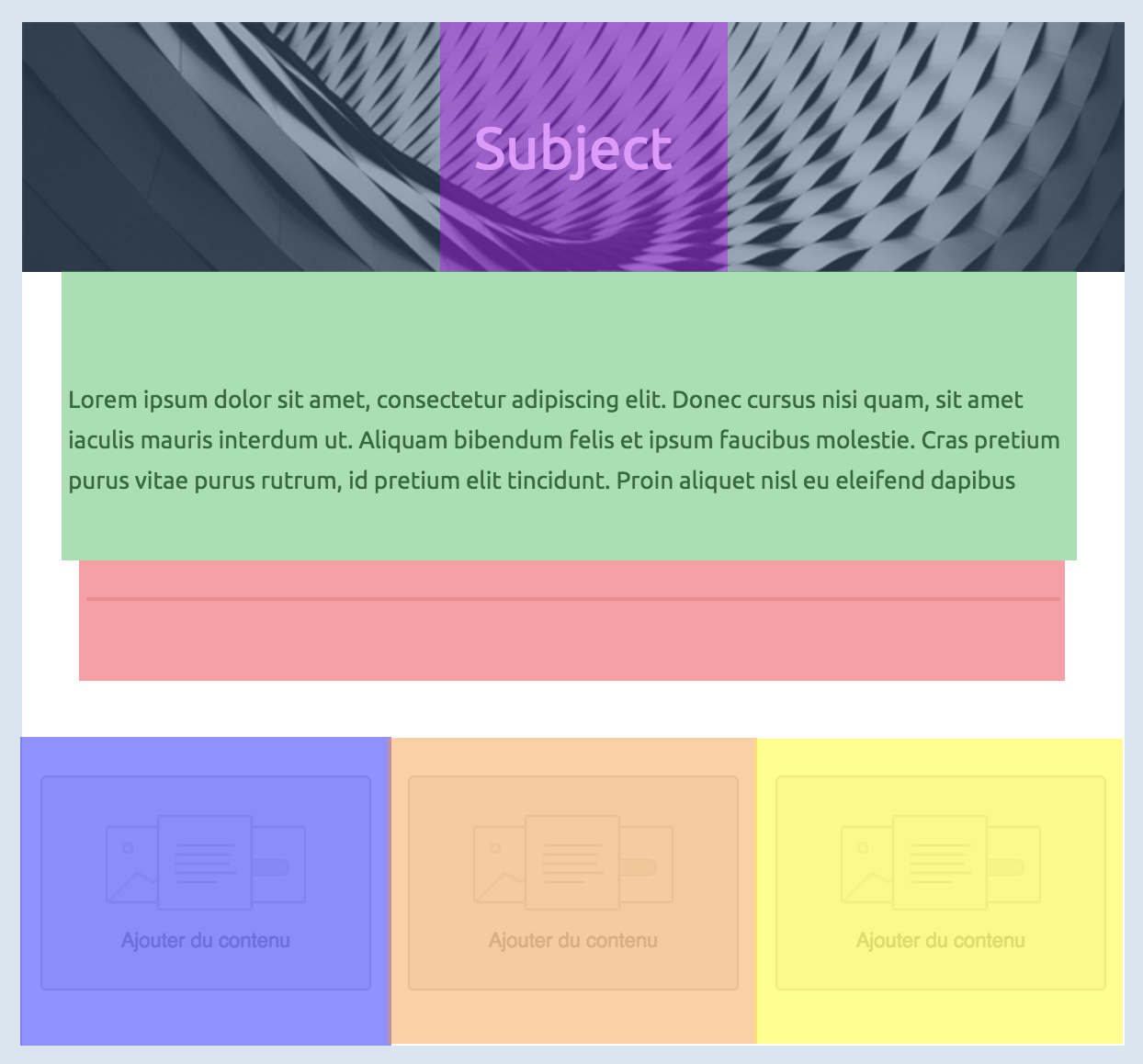
Below, you'll find some basic rules of MJML to keep in mind for later. We'll remind them when useful but better start learning them early on.
Column sizing
Auto sizing
The default behavior of the MJML translation engine is to divide the section space (600px by default, but it can be changed with the width attribute on mj-body) in as many columns as you declare.
Note
Any MJML component included in a column will have a width equivalent to 100% of this column's width.
Let's take the following layout to illustrate this:
<mjml>
  <mj-body>
    <mj-section>
      <mj-column>
        <!-- First column content -->
      </mj-column>
      <mj-column>
        <!-- Second column content -->
      </mj-column>
    </mj-section>
  </mj-body>
</mjml>
Since the first section defines only 2 columns, the engine will translate that in a layout where each column takes 50% of the total space (300px each). If we add a third one, it goes down to 33%, and with a fourth one to 25%.
Manual sizing
You can also manually set the size of your columns, in pixels or percentage, by using the width attribute on mj-column.
Let's take the following layout to illustrate this:
<mjml>
  <mj-body>
    <mj-section>
      <mj-column width="200px">
        <!-- First column content -->
      </mj-column>
      <mj-column width="400px">
        <!-- Second column content -->
      </mj-column>
    </mj-section>
  </mj-body>
</mjml>
Basic layout example
In this section, you're going to learn how to code a basic email template using MJML.
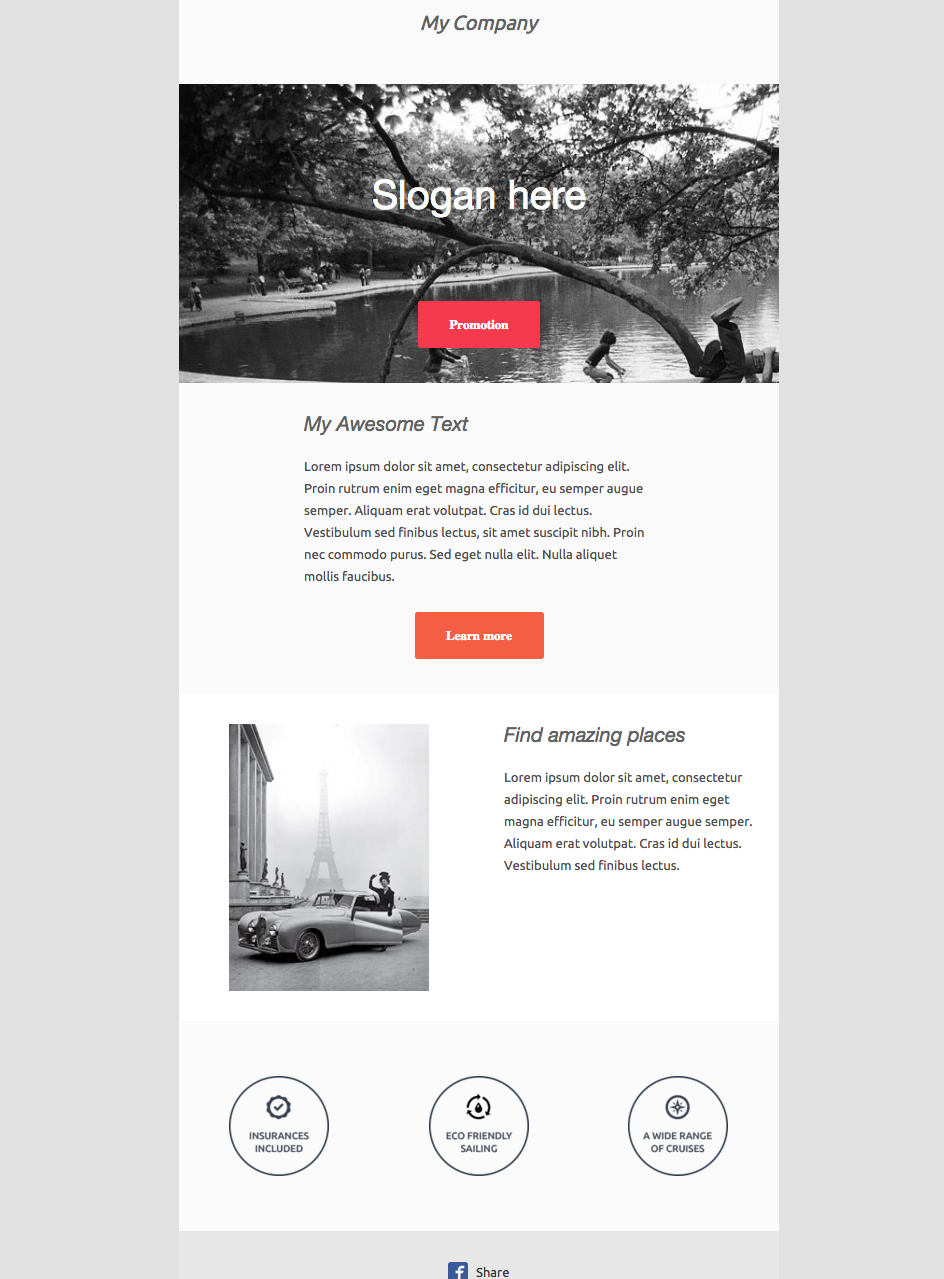
Here‘s what we’re building:
Sections
<mjml>
  <mj-body>
    <!-- Company Header -->
    <mj-section background-color="#f0f0f0"></mj-section>

    <!-- Image Header -->
    <mj-section background-color="#f0f0f0"></mj-section>

    <!-- Introduction Text -->
    <mj-section background-color="#fafafa"></mj-section>

    <!-- 2 columns section -->
    <mj-section background-color="white"></mj-section>

    <!-- Icons -->
    <mj-section background-color="#fbfbfb"></mj-section>

    <!-- Social icons -->
    <mj-section background-color="#f0f0f0"></mj-section>
  </mj-body>
</mjml>
First, we’ll create the basic structure, dividing the email into six sections.
Company Header
<!-- Company Header -->
<mj-section background-color="#f0f0f0">
  <mj-column>
    <mj-text
      align="center"
      font-style="italic"
      font-size="20px"
      color="#626262"
    >
      My Company
    </mj-text>
  </mj-column>
</mj-section>
The first section of the email consists in a centered banner, containing only the company name. The following markup is the MJML representation of the layout we want to obtain.
Important
Remember everything has to be contained within the column.
Image Header
<!-- Image Header -->
<mj-section
  background-url="https://1.bp.blogspot.com/-TPrfhxbYpDY/Uh3Refzk02I/AAAAAAAALw8/5sUJ0UUGYuw/s1600/New+York+in+The+1960's+-+70's+(2).jpg"
  background-size="cover"
  background-repeat="no-repeat"
>
  <mj-column width="600px">
    <mj-text
      align="center"
      color="#fff"
      font-size="40px"
      font-family="Helvetica Neue"
    >
      Slogan here
    </mj-text>

    <mj-button background-color="#F63A4D" href="#"> Promotion </mj-button>
  </mj-column>
</mj-section>
Next comes a section with a background image and a block of text (representing the company slogan) and a button pointing to a page listing all the company promotions.
To add the image header, you will have to replace the section's background-color with a background-url.
Similarly to the first company header, you will have to center the text.
The button href sets where the button links to.
In order to have the background rendered full-width in the column, set the column width to 600px with width="600px".
Introduction Text
<!-- Intro text -->
<mj-section background-color="#fafafa">
  <mj-column width="400px">
    <mj-text
      font-style="italic"
      font-size="20px"
      font-family="Helvetica Neue"
      color="#626262"
    >
      My Awesome Text
    </mj-text>

    <mj-text color="#525252">
      Lorem ipsum dolor sit amet, consectetur adipiscing elit. Proin rutrum enim
      eget magna efficitur, eu semper augue semper. Aliquam erat volutpat. Cras
      id dui lectus. Vestibulum sed finibus lectus, sit amet suscipit nibh.
      Proin nec commodo purus. Sed eget nulla elit. Nulla aliquet mollis
      faucibus.
    </mj-text>

    <mj-button background-color="#F45E43" href="#">Learn more</mj-button>
  </mj-column>
</mj-section>
The introduction text will consist of a heading, the main text and a button.
The title is a regular mj-text tag that can be styled as a heading.
2 Columns Section
<!-- Side image -->
<mj-section background-color="white">
  <!-- Left image -->
  <mj-column>
    <mj-image
      width="200px"
      src="https://designspell.files.wordpress.com/2012/01/sciolino-paris-bw.jpg"
    />
  </mj-column>

  <!-- right paragraph -->
  <mj-column>
    <mj-text
      font-style="italic"
      font-size="20px"
      font-family="Helvetica Neue"
      color="#626262"
    >
      Find amazing places
    </mj-text>

    <mj-text color="#525252">
      Lorem ipsum dolor sit amet, consectetur adipiscing elit. Proin rutrum enim
      eget magna efficitur, eu semper augue semper. Aliquam erat volutpat. Cras
      id dui lectus. Vestibulum sed finibus lectus.</mj-text
    >
  </mj-column>
</mj-section>
This section is made up of two columns. One containing an image, the other containing text.
For the image, note that when a tag does not have any children, you can use the XML self-closing tag syntax: <mj-image />
For the text, you are going to use two mj-text tags like, as previously; one with a heading style, and the other one styled as regular text.
Icons
<!-- Icons -->
<mj-section background-color="#fbfbfb">
  <mj-column>
    <mj-image
      padding="10px"
      width="100px"
      src="https://191n.mj.am/img/191n/3s/x0l.png"
    />
  </mj-column>
  <mj-column>
    <mj-image
      padding="10px"
      width="100px"
      src="https://191n.mj.am/img/191n/3s/x01.png"
    />
  </mj-column>
  <mj-column>
    <mj-image
      padding="10px"
      width="100px"
      src="https://191n.mj.am/img/191n/3s/x0s.png"
    />
  </mj-column>
</mj-section>
This section uses a 3-column layout to display the 3 icons horizontally across the email.
Social Icons
<mj-section background-color="#e7e7e7">
  <mj-column>
    <mj-social>
      <mj-social-element name="facebook">Share</mj-social-element>
    </mj-social>
  </mj-column>
</mj-section>
MJML has an mj-social component as standard. Here, we're going to use facebook only, but there are several default social media sites to choose from, or you can add your own bespoke.
Components
Components are the core of MJML. A component is an abstraction of a more complex responsive HTML layout. It exposes attributes, enabling you to create bespoke styling.
MJML comes out of the box with a set of standard components to help you easily build your first templates without having to reinvent the wheel.
For instance, the mj-button component is, on the inside, a complex HTML layout:
<!-- MJML -->
<mj-button href="#"> Hello There! </mj-button>

<!-- HTML -->
<table
  cellpadding="0"
  cellspacing="0"
  style="border:none;border-radius:3px;"
  align="center"
>
  <tbody>
    <tr>
      <td
        style="background-color:#414141;border-radius:3px;color:#ffffff;cursor:auto;"
        align="center"
        valign="middle"
        bgcolor="#414141"
      >
        <a
          class="mj-content"
          href="#"
          style="display:inline-block;text-decoration:none;background-color:#414141;border:1px solid #414141;border-radius:3px;color:#ffffff;font-size:13px;font-weight:bold;padding:15px 30px;"
          target="_blank"
        >
          Hello There!
        </a>
      </td>
    </tr>
  </tbody>
</table>
Which email clients/versions are supported?
For full details of component support, please visit our support matrix.
mjml
An MJML document starts with an mjml tag. It can contain only mj-head and mj-body tags. Both have the same purpose of head and body in a HTML document.
Attributes
| attribute | accepts | description | default value |
|---|---|---|---|
| owa | string | if set to desktop, this will force the desktop version for older (self-hosted) versions of Outlook.com that don't support media queries (cf. this issue) |
none |
| lang | string | adds a lang attribute in the html and body > div tags |
und |
| dir | string | adds a dir attribute in the html and body > div tags |
auto |
mj-head
Contains components related to the document head such as style and meta elements (see head components).
mj-body
This is the starting point of your email. To aid accessibility, MJML automatically adds a div tag as the child of the body, with the following ARIA attributes role="article", aria-roledescription="email" and aria-label="EMAIL NAME", where 'EMAIL NAME' is taken from the content of the mj-title tag. The lang and dir attributes are also added here, with values taken from the mjml tag.
<mjml>
  <mj-body>
    <!-- Your email goes here -->
  </mj-body>
</mjml>
Attributes
| attribute | accepts | description | default value |
|---|---|---|---|
| background-color | CSS color formats | the general background color | |
| css-class | string | class name, added to the root HTML element created | |
| width | px |
email width | 600px |
mj-include
The mjml-core package allows you to include external .mjml files
to build your email template.
<!-- header.mjml -->
<mj-section>
  <mj-column>
    <mj-text>This is a header</mj-text>
  </mj-column>
</mj-section>
You can wrap your external .mjml files inside the default mjml > mj-body
tags to make it easier to preview outside the main template.
<!-- main.mjml -->
<mjml>
  <mj-body>
    <mj-include path="./header.mjml" />
  </mj-body>
</mjml>
The MJML engine will then replace your included files before starting the rendering process.
Other file types
You can include external .css files which will be inserted in the same way as using an mj-style tag. You need to specify that you're including a CSS file using the attribute type="css" attribute.
If you want the CSS to be inlined, you can use the css-inline="inline" attribute.
<!-- main.mjml -->
<mj-include path="./styles.css" type="css" />
<mj-include path="./inline-styles.css" type="css" css-inline="inline" />
You can also include external html files. They will be inserted the same way as when using an mj-raw tag. You need to specify that you're including an HTML file using the attribute type="html".
<!-- main.mjml -->
<mj-include path="./partial.html" type="html" />
Standard Head components
Head components ease your development process, for example, enabling you to import fonts, define default styles or create classes for MJML components.
mj-attributes
Inside the mj-attributes tag, you can cite other MJML components, like mj-text for example, to override the default settings for that component.
An mj-all tag is like the above, but affects all MJML components.
An mj-class tag creates a named group of MJML attributes you can apply to MJML
components using mj-class="<name>".
<mjml>
 <mj-head>
   <mj-attributes>
     <mj-text padding="0" />
     <mj-class name="blue" color="blue" />
     <mj-class name="big" font-size="20px" />
     <mj-all font-family="Arial" />
   </mj-attributes>
 </mj-head>
 <mj-body>
   <mj-section>
     <mj-column>
       <mj-text mj-class="blue big">
         Hello World!
       </mj-text>
     </mj-column>
   </mj-section>
 </mj-body>
</mjml>
Important
MJML will apply found attributes in the following order:
- inline attributes within tags,
- attributes found in tags within the
mj-attributestag, e.g.mj-text, - the
mj-alltag wuthinmj-attributes, and - the default MJML values.
mj-breakpoint
Allows you to control at what width the layout should change from the desktop/mobile view to the desktop one.
<mjml>
  <mj-head>
    <mj-breakpoint width="320px" />
  </mj-head>
  <mj-body>
    <mj-section>
      <mj-column>
        <mj-text>
          Hello World!
        </mj-text>
      </mj-column>
    </mj-section>
  </mj-body>
</mjml>
Attributes
| attribute | accepts | description | default value |
|---|---|---|---|
| width | px |
breakpoint's value |
mj-font
Imports external fonts and is only applied if the template uses the font.
The href attribute should point to a hosted CSS file that contains a @font-face declaration, for example: https://fonts
.googleapis.com/css?family=Raleway
<mjml>
  <mj-head>
    <mj-font name="Raleway"
      href="https://fonts.googleapis.com/css?family=Raleway" />
  </mj-head>
  <mj-body>
    <mj-section>
      <mj-column>
        <mj-text font-family="Raleway, Arial">
          Hello World!
        </mj-text>
      </mj-column>
     </mj-section>
  </mj-body>
</mjml>
Attributes
| attribute | accepts | description | default value |
|---|---|---|---|
| href | string | URL of a hosted CSS file | |
| name | string | name of the font |
mj-html-attributes
Allows you to add custom attributes on any HTML tag within the generated HTML, using CSS selectors.
It's not needed for most email creations, but can be useful in some cases, e.g. editable templates.
<mjml>
 <mj-head>
   <mj-html-attributes>
     <mj-selector path=".custom div">
       <mj-html-attribute name="data-id">42</mj-html-attribute>
     </mj-selector>
   </mj-html-attributes>
 </mj-head>
 <mj-body>
   <mj-section>
     <mj-column>
       <mj-text css-class="custom">
         Hello World!
       </mj-text>
     </mj-column>
   </mj-section>
 </mj-body>
</mjml>
In the generated HTML, an mj-text tag becomes a td tag with a child div tag.
In this example, the td tag will have the class="custom" attribute. Using the css selector path=".custom div", the div inside the td will get the attribute data-id="42".
To use this component, you will likely have to look at the generated HTML to see exactly where the css-class is applied, to know which CSS selector you need to add your custom attribute to.
You can use multiple mj-selector tags inside a mj-html-attributes tag, and multiple mj-html-attribute tags inside a mj-selector tag.
mj-preview
This tag allows you to set the preview text that will be displayed in the inbox of the recipient.
<mjml>
 <mj-head>
   <mj-preview>Hello MJML</mj-preview>
 </mj-head>
 <mj-body>
   <mj-section>
     <mj-column>
       <mj-text>
         Hello World!
       </mj-text>
     </mj-column>
   </mj-section>
 </mj-body>
</mjml>
mj-preview doesn't support any attributes.
mj-style
Allows you to set CSS styles that will be applied to your MJML document as well as the outputted HTML.
The CSS styles will be added to the head tag of the rendered HTML by default, but can also be inlined by using the inline="inline" attribute.
Here is an example showing its use in combination with the css-class attribute, which is supported by all body components.
<mjml>
  <mj-head>
    <mj-attributes>
      <mj-class name="mjclass" color="green" font-size="30px" />
    </mj-attributes>
    <mj-style inline="inline">
      .blue-text div {
        color: blue !important;
      }
    </mj-style>
    <mj-style>
      .red-text div {
        color: red !important;
        text-decoration: underline !important;
      }
    </mj-style>
  </mj-head>
  <mj-body>
    <mj-section>
      <mj-column>
        <mj-text css-class="red-text">I'm red and underlined</mj-text>
        <mj-text css-class="blue-text">I'm blue because of inline</mj-text>
        <mj-text mj-class="mjclass">I'm green</mj-text>
      </mj-column>
    </mj-section>
  </mj-body>
</mjml>
Tip
MJML generates multiple HTML tags from a single MJML tag. For optimal flexibility, the css-class will be applied to the most outer HTML tag, therefore if you want to target a specific child tag with a CSS selector, you may need to look at the generated HTML to determine the exact selector you need.
Attributes
| attribute | accepts | description | default value |
|---|---|---|---|
| inline | string | set to inline to inline styles |
mj-title
Defines the document's title by populating the title tag. This can be shown in the browsers title bar in some cases.
Its content is also used to populate the value of the aria-label attribute located in the immediate child div of the body tag, which is used to aid accessibility.
<mjml>
 <mj-head>
   <mj-title>Hello MJML</mj-title>
 </mj-head>
 <mj-body>
   <mj-section>
     <mj-column>
       <mj-text>
         Hello World!
       </mj-text>
     </mj-column>
   </mj-section>
 </mj-body>
</mjml>
Standard Body components
Body components ease your development process by providing ready made responsive layouts that you can use to create your email template.
mj-accordion
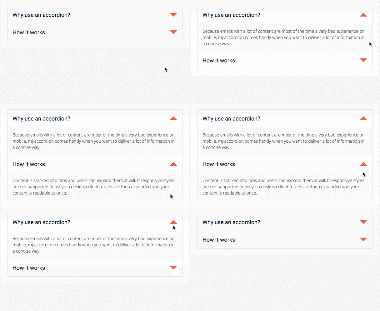
An interactive MJML component that stacks content in tabs, so the information is collapsed and only the titles are visible.
Readers can interact by clicking on the tabs to reveal the content, providing a better experience for mobile users by reducing the amount of scrolling.
Note
mj-accordion-text and mj-accordion-title are "ending tags", which means that they can contain HTML code but they cannot contain other MJML components.
More information about ending tags in this section.
<mjml>
  <mj-head>
    <mj-attributes>
      <mj-accordion border="none" padding="1px" />
      <mj-accordion-element icon-wrapped-url="https://static.mailjet.com/mjml-website/documentation/accordion-arrow-down.png" icon-unwrapped-url="https://static.mailjet.com/mjml-website/documentation/accordion-arrow-up.png" icon-height="24px" icon-width="24px" />
      <mj-accordion-title font-family="Roboto, Open Sans, Helvetica, Arial, sans-serif" background-color="#fff" color="#031017" padding="15px" font-size="18px" />
      <mj-accordion-text font-family="Open Sans, Helvetica, Arial, sans-serif" background-color="#fafafa" padding="15px" color="#505050" font-size="14px" />
    </mj-attributes>
  </mj-head>

  <mj-body>
    <mj-section padding="20px" background-color="#ffffff">
      <mj-column background-color="#dededd">
        <mj-accordion>
          <mj-accordion-element>
            <mj-accordion-title>Why use an accordion?</mj-accordion-title>
            <mj-accordion-text>
              <span style="line-height:20px">
                Because emails with a lot of content are most of the time a very bad experience on mobile, mj-accordion comes handy when you want to deliver a lot of information in a concise way.
              </span>
            </mj-accordion-text>
          </mj-accordion-element>
          <mj-accordion-element>
            <mj-accordion-title>How it works</mj-accordion-title>
            <mj-accordion-text>
              <span style="line-height:20px">
                Content is stacked into tabs and users can expand them at will. If responsive styles are not supported (mostly on desktop clients), tabs are then expanded and your content is readable at once.
              </span>
            </mj-accordion-text>
          </mj-accordion-element>
        </mj-accordion>
      </mj-column>
    </mj-section>
  </mj-body>
</mjml>
Attributes
| attribute | accepts | description | default value |
|---|---|---|---|
| border | string | CSS border format | 2px solid black |
| container-background-color | CSS color formats | background-color of the cell | |
| css-class | string | class name, added to the root HTML element created | |
| font-family | string | font | Ubuntu, Helvetica, Arial, sans-serif |
| icon-align | top middle bottom |
icon alignment | middle |
| icon-height | px % |
icon height | 32px |
| icon-position | left, right |
display icon left or right | right |
| icon-unwrapped-alt | string | alt text when accordion is unwrapped | - |
| icon-unwrapped-url | string | icon when accordion is unwrapped | https://i.imgur.com/w4uTygT.png |
| icon-width | px % |
icon width | 32px |
| icon-wrapped-alt | string | alt text when accordion is wrapped | + |
| icon-wrapped-url | string | icon when accordion is wrapped | https://i.imgur.com/bIXv1bk.png |
| padding | px % |
accordion padding, supports up to 4 parameters | 10px 25px |
| padding-bottom | px % |
accordion bottom padding | |
| padding-left | px % |
accordion left padding | |
| padding-right | px % |
accordion right padding | |
| padding-top | px % |
accordion top padding |
mj-accordion-element
Creates an accordion title/text pair. An accordion can have any number of these pairs.
Note
Inheritance applies for attributes supported in both mj-accordion and
mj-accordion-element except where the latter overrides.
Attributes
| attribute | accepts | description | default value |
|---|---|---|---|
| background-color | CSS color formats | background color | |
| border | string | CSS border format. affects each horizontal border in the accordion except the top one |
|
| css-class | string | class name, added to the root HTML element created | |
| font-family | string | font | |
| icon-align | top middle bottom |
icon alignment | |
| icon-height | px % |
icon width | 32px |
| icon-position | left right |
postion of icon | |
| icon-unwrapped-alt | string | alt text when accordion is unwrapped | |
| icon-unwrapped-url | string | icon when accordion is unwrapped | |
| icon-width | px % |
icon height | 32px |
| icon-wrapped-alt | string | alt text when accordion is wrapped | |
| icon-wrapped-url | string | icon when accordion is wrapped |
mj-accordion-title
Displays the title in a title/text pair.
Attributes
| attribute | accepts | description | default value |
|---|---|---|---|
| background-color | CSS color formats | background color | |
| color | CSS color formats | text color | |
| css-class | string | class name, added to the root HTML element created | |
| font-family | string | font family | |
| font-size | px |
font size | 13px |
| font-weight | string | text thickness | |
| padding | px % |
accordion title padding, supports up to 4 parameters | 16px |
| padding-bottom | px % |
accordion title bottom padding | |
| padding-left | px % |
accordion title left padding | |
| padding-right | px % |
accordion title right padding | |
| padding-top | px % |
accordion title top padding |
mj-accordion-text
Displays the text in a title/text pair.
Attributes
| attribute | accepts | description | default value |
|---|---|---|---|
| background-color | CSS color formats | background color | |
| color | CSS color formats | text color | |
| css-class | string | class name, added to the root HTML element created | |
| font-family | string | font family | |
| font-size | px |
font size | 13px |
| font-weight | string | text thickness | |
| letter-spacing | px em |
letter spacing | |
| line-height | px % |
space between the lines | 1 |
| padding | px % |
accordion text padding, supports up to 4 parameters | 16px |
| padding-bottom | px % |
accordion text bottom padding | |
| padding-left | px % |
accordion text left padding | |
| padding-right | px % |
accordion text right padding | |
| padding-top | px % |
accordion text top padding |
mj-button
Displays a customizable button.

Important
The mj-button won't be fully clickable because of client support.
See discussion at
Issue #359.
<mjml>
  <mj-body>
    <mj-section>
      <mj-column>
        <mj-button font-family="Helvetica" background-color="#f45e43" color="white">
          Don't click me!
         </mj-button>
      </mj-column>
    </mj-section>
  </mj-body>
</mjml>
Note
mj-button is an "ending tag", which means that it can contain HTML code but it cannot contain other MJML components.
More information about ending tags in this section.
Attributes
| attribute | accepts | description | default value |
|---|---|---|---|
| align | left center right |
horizontal alignment | center |
| background-color | CSS color formats | button background-color | #414141 |
| border | string | CSS border format | none |
| border-bottom | string | CSS border format | |
| border-left | string | CSS border format | |
| border-radius | string | border radius | 3px |
| border-right | string | CSS border format | |
| border-top | string | CSS border format | |
| color | CSS color formats | text color | #ffffff |
| container-background-color | CSS color formats | button container background color | |
| css-class | string | class name, added to the root HTML element created | |
| font-family | string | font name | Ubuntu, Helvetica, Arial, sans-serif |
| font-size | px |
text size | 13px |
| font-style | string | CSS values, e.g. normal italic oblique |
|
| font-weight | string | text thickness | normal |
| height | px % |
button height | |
| href | string | URL format | |
| inner-padding | px % |
inner button padding, supports up to 4 parameters |
10px 25px |
| letter-spacing | px em |
letter-spacing | |
| line-height | px % |
line-height on link | 120% |
| name | string | specify the name attribute for the button link | |
| padding | px % |
button container padding, supports up to 4 parameters | 10px 25px |
| padding-bottom | px % |
button container bottom padding | |
| padding-left | px % |
button container left padding | |
| padding-right | px % |
button container right padding | |
| padding-top | px % |
button container top padding | |
| rel | string | specify the rel attribute for the button link | |
| target | string | specify the target attribute for the button link | _blank |
| text-align | left center right |
text-align button content | |
| text-decoration | string | underline/overline/none | none |
| text-transform | string | capitalize/uppercase/lowercase | none |
| title | string | tooltip & accessibility | |
| vertical-align | top bottom middle vertical |
vertical alignment | middle |
| width | px % |
button width |
mj-carousel
Displays a gallery of images or "carousel". Readers can interact by hovering and clicking on thumbnails depending on the email client they use.

<mjml>
  <mj-body>
    <mj-section>
      <mj-column>
        <mj-carousel>
          <mj-carousel-image src="https://static.mailjet.com/mjml-website/documentation/carousel-1.jpg" />
          <mj-carousel-image src="https://static.mailjet.com/mjml-website/documentation/carousel-2.jpg" />
          <mj-carousel-image src="https://static.mailjet.com/mjml-website/documentation/carousel-3.jpg" />
        </mj-carousel>
      </mj-column>
    </mj-section>
  </mj-body>
</mjml>
Attributes
| attribute | accepts | description | default value |
|---|---|---|---|
| align | left center right |
horizontal alignment | center |
| border-radius | px % |
border radius | 6px |
| container-background-color | CSS color formats | column background color | |
| css-class | string | class name, added to the root HTML element created | |
| icon-width | px % |
width of the icons on left and right of the main image | 44px |
| left-icon | string | icon on the left of the main image | https://i.imgur.com/xTh3hln.png |
| padding | px % |
carousel padding, supports up to 4 parameters | |
| padding-bottom | px % |
carousel bottom padding | |
| padding-left | px % |
carousel left padding | |
| padding-right | px % |
carousel right padding | |
| padding-top | px % |
carousel top padding | |
| right-icon | string | icon on the right of the main image | https://i.imgur.com/os7o9kz.png |
| tb-border | string | border of the thumbnails in CSS border format | 2px solid transparent |
| tb-border-radius | px % |
border-radius of the thumbnails | 6px |
| tb-hover-border-color | CSS color formats | border color of the hovered thumbnail | #fead0d |
| tb-selected-border-color | CSS color formats | border color of the selected thumbnail | #ccc |
| tb-width | px % |
thumbnail width | |
| thumbnails | visible hidden supported |
display the thumbnails | hidden |
mj-carousel-image
Enables you to add and style the images in the carousel.
Note
mj-carousel-image is an "ending tag", which means that it can contain HTML code but it cannot contain other MJML components.
More information about ending tags in this section.
Attributes
| attribute | accepts | description | default value |
|---|---|---|---|
| alt | string | image description | '' |
| border-radius | px % |
border radius of the main image | |
| css-class | string | class name, added to the root HTML element created | |
| href | string | link to redirect to on click, URL format |
|
| rel | string | specify the rel attribute | |
| src | string | URL format | |
| target | string | link target on click | _blank |
| tb-border | string | CSS border format | |
| tb-border-radius | px % |
border radius of the thumbnail | |
| thumbnails-src | string | specify a different thumbnail image in URL format | |
| title | string | tooltip & accessibility |
mj-column
Columns enable you to organize the content of your sections into distinct columns which stack when viewed on a mobile device.
They must be located within mj-section tags in order to be considered by the engine.
Caution
The sum of columns in a section cannot be greater than
the width of the parent mj-section (or 100%).
Every single column has to contain something because they are responsive containers, and will be vertically stacked on a mobile view. Any standard component, or component that you have defined and registered, can be placed within a column – except mj-column or mj-section elements.
<mjml>
  <mj-body>
    <mj-section>
      <mj-column>
        <!-- Your first column -->
      </mj-column>
      <mj-column>
        <!-- Your second column -->
      </mj-column>
    </mj-section>
  </mj-body>
</mjml>
Caution
Columns are used as a container for your content and should not be used to offset. Any MJML component included in a column will have a width equivalent to 100% of this column's width.
Caution
Neither the mj-column or mj-section tags can be nested in an mj-column tag
Attributes
| attribute | accepts | description | default attributes |
|---|---|---|---|
| background-color | CSS color formats | background color for a column | |
| border | string | CSS border format | |
| border-bottom | string | CSS border format | |
| border-left | string | CSS border format | |
| border-radius | px % |
border radius | |
| border-right | string | CSS border format | |
| border-top | string | CSS border format | |
| css-class | string | class name, added to the root HTML element created | |
| direction | ltr rtl |
set the display order of direct children | ltr |
| inner-background-color | CSS color formats | inner background color for column; requires a padding | |
| inner-border | string | CSS border; requires a padding format | |
| inner-border-bottom | string | CSS border format; requires a padding | |
| inner-border-left | string | CSS border format; requires a padding | |
| inner-border-radius | px % |
border radius ; requires a padding | |
| inner-border-right | string | CSS border format; requires a padding | |
| inner-border-top | string | CSS border format; requires a padding | |
| padding | px % |
column padding, supports up to 4 parameters | |
| padding-bottom | px % |
column bottom padding | |
| padding-left | px % |
column left padding | |
| padding-right | px % |
column right padding | |
| padding-top | px % |
column top padding | |
| width | px % |
column width | (100 / number of non-raw elements in section)% |
| vertical-align | top middle bottom |
vertical alignment. Note: middle only applies when all mj-column instances use it |
top |
mj-divider
Displays a horizontal divider that can be customized like a HTML border.
<mjml>
  <mj-body>
    <mj-section>
      <mj-column>
        <mj-divider border-width="1px" border-style="dashed" border-color="lightgrey" />
      </mj-column>
    </mj-section>
  </mj-body>
</mjml>
Attributes
| attribute | accepts | description | default value |
|---|---|---|---|
| align | left center right |
horizontal alignment | center |
| border-color | CSS color formats | divider color | #000000 |
| border-style | string | CSS values, e.g. dashed dotted solid |
solid |
| border-width | px |
divider's border width | 4px |
| container-background-color | CSS color formats | inner element background color | |
| css-class | string | class name, added to the root HTML element created | |
| padding | px % |
divider padding, supports up to 4 parameters | 10px 25px |
| padding-bottom | px % |
divider bottom padding | |
| padding-left | px % |
divider left padding | |
| padding-right | px % |
divider right padding | |
| padding-top | px % |
divider top padding | |
| width | px % |
divider width | 100% |
mj-group
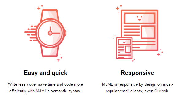
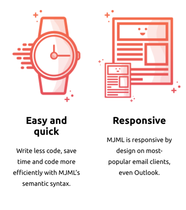
Prevent adjacent mj-column instances from stacking on mobile by wrapping them inside an mj-group tag, keeping them side by side on mobile.
<mjml>
  <mj-body>
    <mj-section>
      <mj-group>
        <mj-column>
          <mj-image width="137px" height="185px" padding="0" src="https://static.mailjet.com/mjml-website/documentation/group-1.png" />
          <mj-text align="center">
            <h2>Easy and quick</h2>
            <p>Write less code, save time and code more efficiently with MJML’s semantic syntax.</p>
          </mj-text>
        </mj-column>
        <mj-column>
          <mj-image width="166px" height="185px" padding="0" src="https://static.mailjet.com/mjml-website/documentation/group-2.png" />
          <mj-text align="center">
            <h2>Responsive</h2>
            <p>MJML is responsive by design on most-popular email clients, even Outlook.</p>
          </mj-text>
        </mj-column>
      </mj-group>
    </mj-section>
  </mj-body>
</mjml>
Important
Column inside a group must have a width in percentage, not in pixel.
Note
You can nest both mj-column and mj-group inside a mj-section.
Attributes
| attribute | accepts | description | default attributes |
|---|---|---|---|
| background-color | CSS color formats | background color for a group | |
| css-class | string | class name, added to the root HTML element created | |
| direction | ltr rtl |
set the display order of direct children | ltr |
| vertical-align | string | CSS values, e.g. middle top bottom |
|
| width | px % |
group width | (100 / number of non-raw elements in section)% |
mj-hero
Displays a hero image and behaves like an mj-section tag with a single mj-column tag.
The background-height and background-width attributes are mandatory and it's best to use an image with width the same as the mj-body (width="600px" by default) and height the same or larger than the height of mj-hero.
Use background-color to provide a fallback color in case an email client doesn't support background-url.
Note
The height attribute is only required for mode="fixed-height".

<mjml>
  <mj-body>
    <mj-hero
      mode="fixed-height"
      height="469px"
      background-width="600px"
      background-height="469px"
      background-url=
          "https://static.mailjet.com/mjml-website/documentation/hero.jpg"
      background-color="#2a3448"
      padding="100px 0px">
      <mj-text
        padding="20px"
        color="#ffffff"
        font-family="Helvetica"
        align="center"
        font-size="45px"
        line-height="45px"
        font-weight="900">
        GO TO SPACE
      </mj-text>
      <mj-button href="https://mjml.io/" align="center">
        ORDER YOUR TICKET NOW
      </mj-button>
    </mj-hero>
  </mj-body>
</mjml>

<mjml>
  <mj-body>
    <mj-hero
      mode="fluid-height"
      background-width="600px"
      background-height="469px"
      background-url=
          "https://static.mailjet.com/mjml-website/documentation/hero.jpg"
      background-color="#2a3448"
      padding="100px 0px">
      <mj-text
        padding="20px"
        color="#ffffff"
        font-family="Helvetica"
        align="center"
        font-size="45px"
        line-height="45px"
        font-weight="900">
        GO TO SPACE
      </mj-text>
      <mj-button href="https://mjml.io/" align="center">
        ORDER YOUR TICKET NOW
      </mj-button>
    </mj-hero>
  </mj-body>
</mjml>
Attributes
| attribute | accepts | description | default value |
|---|---|---|---|
| background-color | CSS color formats | hero background color | #ffffff |
| background-height | px % |
height of the image used, mandatory | |
| background-position | string | CSS values, i.e. left center right + top center bottom |
center center |
| background-url | string | absolute background in URL format | null |
| background-width | px % |
width of the image used, mandatory | inherits parent element width |
| border-radius | string | border radius | |
| css-class | string | class name, added to the root HTML element created | |
| height | px % |
hero section height, (required for fixed-height mode) |
0px |
| inner-background-color | CSS color formats | content background color | |
| mode | string | fluid-height or fixed-height |
fluid-height |
| padding | px % |
hero padding, supports up to 4 parameters | 0px |
| padding-bottom | px % |
hero bottom padding | null |
| padding-left | px % |
hero left padding | null |
| padding-right | px % |
hero right padding | null |
| padding-top | px % |
hero top padding | null |
| vertical-align | top middle bottom |
content vertical alignment | top |
- Fixed height:
Try it live - Fluid height:
Try it live
mj-image
Displays a responsive image in your email. It is similar to the HTML <img /> tag.
Note that if no width is provided, the image will use the parent column width.
<mjml>
  <mj-body>
    <mj-section>
      <mj-column>
        <mj-image width="300px" src="https://static.mailjet.com/mjml-website/documentation/image.png" />
      </mj-column>
    </mj-section>
  </mj-body>
</mjml>
Attributes
| attribute | accepts | description | default value |
|---|---|---|---|
| align | left center right |
image alignment | center |
| alt | string | image description | '' |
| border | string | CSS border format | 0 |
| border-bottom | string | CSS border format | |
| border-left | string | CSS border format | |
| border-radius | px % |
border radius | |
| border-right | string | CSS border format | |
| border-top | string | CSS border format | |
| container-background-color | CSS color formats | inner element background color | |
| css-class | string | class name, added to the root HTML element created | |
| fluid-on-mobile | boolean | if true, will be full width on mobile even if width is set |
|
| font-size | px |
size of the alt text when image is not rendered | 13px |
| height | px |
image height | auto |
| href | string | link to redirect to on click, in URL format | |
| max-height | px % |
specify the maximum height of an image | |
| name | string | specify the link name attribute | |
| padding | px % |
hero padding, supports up to 4 parameters | 10px 25px |
| padding-bottom | px % |
hero bottom padding | |
| padding-left | px % |
hero left padding | |
| padding-right | px % |
hero right padding | |
| padding-top | px % |
hero top padding | |
| rel | string | specify the rel attribute | |
| sizes | string | set width based on query | |
| src | string | image source in URL format | |
| srcset | string | enables to set a different image source based on the viewport, using CSS syntax | |
| target | string | link target on click | _blank |
| title | string | tooltip & accessibility | |
| usemap | string | reference to image map, be careful, it isn't supported everywhere | |
| width | px |
image width | inherits parent width |
mj-navbar
Displays a navigation menu with an optional hamburger mode for mobile devices.
<mjml>
  <mj-body>
    <mj-section background-color="#ef6451">
      <mj-column>
        <mj-navbar base-url="https://mjml.io" hamburger="hamburger" ico-color="#ffffff">
            <mj-navbar-link href="/gettings-started-onboard" color="#ffffff">Getting started</mj-navbar-link>
            <mj-navbar-link href="/try-it-live" color="#ffffff">Try it live</mj-navbar-link>
            <mj-navbar-link href="/templates" color="#ffffff">Templates</mj-navbar-link>
            <mj-navbar-link href="/components" color="#ffffff">Components</mj-navbar-link>
        </mj-navbar>
      </mj-column>
    </mj-section>
  </mj-body>
</mjml>

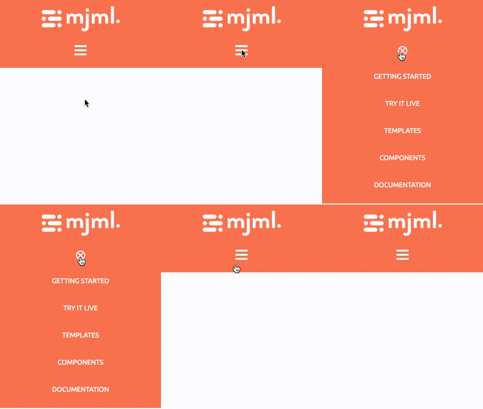
Note
The hamburger feature works only on Apple Mail clients, when the width is below the specified (or default) breakpoint. For other email clients, the links are displayed inline and the hamburger icon is not visible.
Note
All attributes prefixed with ico- help to customize the hamburger icon, hence they only work with the hamburger mode enabled.
Attributes
| attribute | accepts | description | default value |
|---|---|---|---|
| align | leftcenterright |
align content | center |
| base-url | string | base URL for child components | null |
| css-class | string | class name, added to the root HTML element created | |
| hamburger | string | activate the hamburger navigation on mobile if the value is hamburger | null |
| ico-align | leftcenterright |
hamburger icon alignment ( hamburger="hamburger" required) |
center |
| ico-close | string | char code for a custom close icon, e.g. ASCII code decimal ( hamburger="hamburger" required) |
⊗ |
| ico-color | CSS color formats | hamburger icon color ( hamburger="hamburger" required) |
#000000 |
| ico-font-family | string | hamburger icon font ( hamburger="hamburger" required) |
Ubuntu, Helvetica, Arial, sans-serif |
| ico-font-size | px % |
hamburger icon size ( hamburger="hamburger" required) |
30px |
| ico-line-height | px % |
hamburger icon line height ( hamburger="hamburger" required) |
30px |
| ico-open | string | char code for a custom open icon, e.g. ASCII code decimal ( hamburger="hamburger" required) |
☰ |
| ico-padding | px % |
hamburger icon padding, supports up to 4 parameters ( hamburger="hamburger" required) |
10px |
| ico-padding-bottom | px % |
hamburger icon bottom padding ( hamburger="hamburger" required) |
|
| ico-padding-left | px % |
hamburger icon left padding ( hamburger="hamburger" required) |
|
| ico-padding-right | px % |
hamburger icon right padding ( hamburger="hamburger" required) |
|
| ico-padding-top | px % |
hamburger icon top padding ( hamburger="hamburger" required) |
|
| ico-text-decoration | string | hamburger icon text decoration e.g. none underline overline line-through( hamburger="hamburger" required) |
none |
| ico-text-transform | string | hamburger icon text transformation none capitalize uppercase lowercase( hamburger="hamburger" required) |
uppercase |
| padding | px % |
navbar padding, supports up to 4 parameters | |
| padding-bottom | px % |
navbar bottom padding | |
| padding-left | px % |
navbar left padding | |
| padding-right | px % |
navbar right padding | |
| padding-top | px % |
navbar top padding |
mj-navbar-link
Used to display an individual link in the navbar. Individual links of the menu should be wrapped inside mj-navbar.
Important
The mj-navbar-link component must be used inside an mj-navbar component only.
Note
mj-navbar-link is an "ending tag", which means that it can contain HTML code but it cannot contain other MJML components.
More information about ending tags in this section.
Attributes
| attribute | accepts | description | default value |
|---|---|---|---|
| color | CSS color formats | text color | #000000 |
| css-class | string | class name, added to the root HTML element created | |
| font-family | string | font | Ubuntu, Helvetica, Arial, sans-serif |
| font-size | px |
text size | 13px |
| font-style | string | CSS values, i.e. normal italic oblique |
|
| font-weight | string | text thickness | |
| href | string | link to redirect to on click, in URL format | |
| letter-spacing | px em |
letter-spacing | |
| line-height | px % |
space between the lines | 22px |
| name | string | specify the link name attribute | |
| padding | px % |
navbar link padding, supports up to 4 parameters | 15px 10px |
| padding-bottom | px % |
bottom padding | |
| padding-left | px % |
left padding | |
| padding-right | px % |
right padding | |
| padding-top | px % |
top padding | |
| rel | string | specify the rel attribute | |
| target | string | link target on click | |
| text-decoration | string | CSS values, i.e. underline overline none |
none |
| text-transform | string | CSS values, i.e. capitalize uppercase lowercase none |
uppercase |
mj-raw
Displays raw HTML that is not parsed by the MJML engine. Anything left inside this tag should be raw, responsive HTML. If placed inside the mj-head tag, its content will be added at the end of the HTML <head> tag.
<mjml>
  <mj-body>
    <mj-raw>
      <!-- Your content goes here -->
    </mj-raw>
  </mj-body>
</mjml>
You can tell the minifier to ignore some content by wrapping it between two <!-- htmlmin:ignore --> tags.
You can use mj-raw to add a templating language. Note that if you and use the minify option, you might get a Parsing error, especially when using the < character. These can be ignored by using the <!-- htmlmin:ignore --> tags.mlmin:ignore -->` tags.
<mjml>
  <mj-body>
    <mj-raw>
      <!-- htmlmin:ignore --> {% if foo < 5 %} <!-- htmlmin:ignore -->
    </mj-raw>
      <!-- Some mjml section -->
    <mj-raw>
      {% endif %}
    </mj-raw>
  </mj-body>
</mjml>
Note
mj-raw is an "ending tag", which means that it can contain HTML code but it cannot contain other MJML components.
More information about ending tags in this section.
You can also use mj-raw to add text at the beginning of the generated html, before the <!doctype html> line. For this you need to:
- add the
mj-rawtag inside themjmltag, outside of themj-headandmj-bodytags. - add the
position="file-start"attribute to themj-rawtag:
Note that if you put multiple lines in this mj-raw and use the minify option, these lines will be joined into a single line by the minifier. These can be ignored by using the <!-- htmlmin:ignore --> tags.
<mjml>
  <mj-raw position="file-start">This will be added at the beginning of the file</mj-raw>
  <mj-body>
    <!-- Your content goes here -->
  </mj-body>
</mjml>
mj-section
Sections are rows within your email. They will be used to structure the layout.
<mjml>
  <mj-body>
    <mj-section full-width="full-width" background-color="red">
      <!-- Your columns go here -->
    </mj-section>
  </mj-body>
</mjml>
The full-width attribute will be used to manage the background width. Setting it will change the width of the section from the default 600px to 100%.
Note
To invert the order in which columns display in the desktop view, first setup your columns in the order you want them to appear stacked in the mobile view and then add direction="rtl" to the mj-section tag.
Caution
mj-section tags cannot nest in other mj-section tags
Important
Limitations of background-image background-size and background-position in Outlook desktop :
- If
background-sizeis not specified,no-repeatwill be ignored in Outlook. - If the specified
background-sizeis a single attribute in percent, the height will beautoas in standard CSS. In Outlook, the image will never overflow the element, it will shrink instead of being cropped similar to other clients.
Attributes
| attribute | accepts | description | default value |
|---|---|---|---|
| background-color | CSS color formats | section color | |
| background-position | string | CSS values, i.e. left center right + top center bottom (see outlook limitations below) |
top center |
| background-position-x | string | CSS values, i.e. left center right (see outlook limitations below) |
|
| background-position-y | string | CSS values, i.e. top center bottom (see outlook limitations below) |
|
| background-repeat | repeat no-repeat |
set the background image to repeat | |
| background-size | string | CSS values e.g. auto cover contain px % size |
auto |
| background-url | string | background image, in URL format | |
| border | string | CSS border format | |
| border-bottom | string | CSS border format | |
| border-left | string | CSS border format | |
| border-radius | string | border radius | |
| border-right | string | CSS border format | |
| border-top | string | CSS border format | |
| css-class | string | class name, added to the root HTML element created | |
| direction | ltr rtl |
set the display order of direct children | ltr |
| full-width | full-width false |
make the section full-width | |
| padding | px % |
section padding, supports up to 4 parameters | 20px 0 |
| padding-bottom | px % |
section bottom padding | |
| padding-left | px % |
section left padding | |
| padding-right | px % |
section right padding | |
| padding-top | px % |
section top padding | |
| text-align | left center right |
CSS text-align | center |
mj-social
Displays calls-to-action for various social networks with their associated logo. You can add multiple social networks using mj-social-element tags.

Caution
The mj-social-element name attribute is a shortcut for some common social elements. You should avoid rely too much on this as those icons are hosted by Mailjet for their Email Builder. Use custom element syntax instead.
<mjml>
  <mj-body>
    <mj-section>
      <mj-column>
        <mj-social font-size="15px" icon-size="30px" mode="horizontal">
          <mj-social-element name="facebook" href="https://mjml.io/">
            Facebook
          </mj-social-element>
          <mj-social-element name="google" href="https://mjml.io/">
            Google
          </mj-social-element>
          <mj-social-element name="twitter" href="https://mjml.io/">
            Twitter
          </mj-social-element>
          <mj-social-element name="x" href="https://mjml.io/">
            X
          </mj-social-element>
        </mj-social>
      </mj-column>
    </mj-section>
  </mj-body>
</mjml>
Attributes
| attribute | accepts | description | default value |
|---|---|---|---|
| align | left right center |
align content | center |
| border-radius | px % |
border radius | 3px |
| color | CSS color formats | text color | #333333 |
| css-class | string | class name, added to the root HTML element created | |
| container-background-color | CSS color formats | inner element background color | |
| font-family | string | font name | Ubuntu, Helvetica, Arial, sans-serif |
| font-size | px |
font size | 13px |
| font-style | string | font style | normal |
| font-weight | string | font weight | normal |
| icon-height | px % |
icon height, overrides icon-size |
icon-size |
| icon-padding | px % |
padding around the icons | |
| icon-size | px % |
icon size (width and height) | 20px |
| inner-padding | px % |
social network surrounding padding | null |
| line-height | px % |
space between lines | 22px |
| mode | horizontal vertical |
direction of social elements | horizontal |
| padding | px % |
social padding, supports up to 4 parameters | 10px 25px |
| padding-bottom | px % |
bottom padding | |
| padding-left | px % |
left padding | |
| padding-right | px % |
right padding | |
| padding-top | px % |
top padding | |
| text-padding | px % |
padding around the text | |
| text-decoration | string | CSS values, e.g. underline overline none |
none |
mj-social-element
This component enables you to display a given social network inside mj-social.
Note that default icons are transparent, which allows background-color to actually be the icon color.
Note
mj-social-element is an "ending tag", which means that it can contain HTML code but it cannot contain other MJML components.
More information about ending tags in this section.
Attributes
| attribute | accepts | description | default value |
|---|---|---|---|
| align | left center right |
align content | center |
| alt | string | image alt attribute | '' |
| background-color | CSS color formats | icon color | Each social name has its own default |
| border-radius | px |
border radius | 3px |
| color | CSS color formats | text color | #000 |
| css-class | string | class name, added to the root HTML element created | |
| font-family | string | font name | Ubuntu, Helvetica, Arial, sans-serif |
| font-size | px |
font size | 13px |
| font-style | string | font style | |
| font-weight | string | font weight | |
| href | string | button redirection, in URL format | |
| icon-height | percent/px | icon height, overrides icon-size | icon-size |
| icon-padding | px % |
padding around the icon | |
| icon-position | left right |
sets the side of the icon | |
| icon-size | px % |
icon size (width and height) | |
| line-height | px % |
space between lines | 1 |
| name | string | social network name, see supported list below | |
| padding | px % |
social element padding, supports up to 4 parameters | 4px |
| padding-bottom | px % |
bottom padding | |
| padding-left | px % |
left padding | |
| padding-right | px % |
right padding | |
| padding-top | px % |
top padding | |
| rel | string | specify the rel attribute for the link | |
| sizes | string | set icon width based on query | |
| src | string | image source, in URL format | Each social name has its own default |
| srcset | string | enables to set a different image source based on the viewport, using CSS syntax | |
| target | string | link target | _blank |
| text-decoration | string | CSS values, e.g. underline overline none |
none |
| text-padding | px % |
padding around the text | 4px 4px 4px 0 |
| title | string | image title attribute | |
| vertical-align | top middle bottom |
vertically align elements | middle |
Supported networks with a share url:
facebooktwitterxgooglepinterestlinkedintumblrxing
Without a share url:
githubinstagramwebsnapchatyoutubevimeomediumsoundclouddribbble
When using a network with share url, the href attribute will be inserted in the share url (i.e. https://www.facebook.com/sharer/sharer.php?u=[[URL]]). To keep your href unchanged, add -noshare to the network name. Example :
<mj-social-element name="twitter-noshare" href="my-unchanged-url">Twitter</mj-social-element>
Custom Social Element
You can add any unsupported network like this:
<mj-social-element href="url" background-color="#FF00FF" src="path-to-your-icon">
  Optional label
</mj-social-element>
You can also use mj-social this way with no href attribute to make a simple list of inlined images-texts.
mj-spacer
Displays a blank space, that can be used to separate content.
<mjml>
  <mj-body>
    <mj-section>
      <mj-column>
        <mj-text>A first line of text</mj-text>
        <mj-spacer height="50px" />
        <mj-text>A second line of text</mj-text>
      </mj-column>
    </mj-section>
  </mj-body>
</mjml>
Attributes
| attribute | accepts | description | default value |
|---|---|---|---|
| container-background-color | CSS color formats | inner element background color | |
| css-class | string | class name, added to the root HTML element created | |
| height | px % |
spacer height | 0px |
| padding | px % |
spacer padding, supports up to 4 parameters | |
| padding-bottom | px % |
bottom padding | |
| padding-left | px % |
left padding | |
| padding-right | px % |
right padding | |
| padding-top | px % |
top padding |
mj-table
Display a data table. It only accepts plain HTML.
<mjml>
  <mj-body>
    <mj-section>
      <mj-column>
        <mj-table>
          <tr style="border-bottom:1px solid #ecedee;text-align:left;padding:15px 0;">
            <th style="padding: 0 15px 0 0;">Year</th>
            <th style="padding: 0 15px;">Language</th>
            <th style="padding: 0 0 0 15px;">Inspired from</th>
          </tr>
          <tr>
            <td style="padding: 0 15px 0 0;">1995</td>
            <td style="padding: 0 15px;">PHP</td>
            <td style="padding: 0 0 0 15px;">C, Shell Unix</td>
          </tr>
          <tr>
            <td style="padding: 0 15px 0 0;">1995</td>
            <td style="padding: 0 15px;">JavaScript</td>
            <td style="padding: 0 0 0 15px;">Scheme, Self</td>
          </tr>
        </mj-table>
      </mj-column>
    </mj-section>
  </mj-body>
</mjml>
Note
mj-table is an "ending tag", which means that it can contain HTML code but it cannot contain other MJML components. Therefore, it will accept any tag you would add inside an HTML table tag.
More information about ending tags in this section.
Attributes
| attribute | accepts | description | default value |
|---|---|---|---|
| align | left right center |
table horizontal alignment | left |
| border | string | CSS border format | none |
| cellpadding | integer | space between cells | 0 |
| cellspacing | integer | space between cell and border | 0 |
| color | CSS color formats | text header & footer color | #000000 |
| container-background-color | CSS color formats | inner element background color | |
| css-class | string | class name, added to the root HTML element created | |
| font-family | string | font name | Ubuntu, Helvetica, Arial, sans-serif |
| font-size | px |
font size | 13px |
| line-height | px % |
space between lines | 22px |
| padding | px % |
outer table padding, supports up to 4 parameters | 10px 25px |
| padding-bottom | px % |
bottom padding | |
| padding-left | px % |
left padding | |
| padding-right | px % |
right padding | |
| padding-top | px % |
top padding | |
| role | none presentation |
specify the role attribute | |
| table-layout | auto fixed initial inherit |
sets the table layout | auto |
| width | px % auto |
table width | 100% |
mj-text
Displays text which can be styled.
<mjml>
 <mj-body>
   <mj-section>
     <mj-column>
       <mj-text font-family="Helvetica" color="#F45E43">
         <h1>Title</h1>
         <p>Paragraph</p>
         <p style="font-family:Comic Sans Ms">Another paragraph</p>
       </mj-text>
     </mj-column>
   </mj-section>
 </mj-body>
</mjml>
Note
mj-text is an "ending tag", which means that it can contain HTML code but it cannot contain other MJML components.
More information about ending tags in this section.
Attributes
| attribute | accepts | description | default value |
|---|---|---|---|
| align | left right center justify |
text-alignment | left |
| color | CSS color formats | text color | #000000 |
| container-background-color | CSS color formats | inner element background color | |
| css-class | string | class name, added to the root HTML element created | |
| font-family | string | font | Ubuntu, Helvetica, Arial, sans-serif |
| font-size | px |
text size | 13px |
| font-style | string | CSS values, e.g. normal italic oblique |
|
| font-weight | string | text thickness | |
| height | px |
height of the element | |
| letter-spacing | px em |
letter spacing | |
| line-height | px % |
space between the lines | 1 |
| padding | px % |
text padding, supports up to 4 parameters | 10px 25px |
| padding-bottom | px % |
bottom offset | |
| padding-left | px % |
left offset | |
| padding-right | px % |
right offset | |
| padding-top | px % |
top offset | |
| text-decoration | string | CSS values, e.g. underline overline none |
|
| text-transform | string | CSS values, i.e. capitalize uppercase lowercase none |
mj-wrapper
Enables you to wrap multiple mj-section tags together. It's especially useful to achieve nested layouts with shared border or background images across sections.
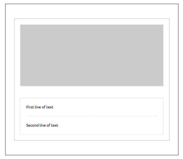
<mjml>
  <mj-body>
    <mj-wrapper border="1px solid #000000" padding="50px 30px">
      <mj-section border-top="1px solid #aaaaaa" border-left="1px solid #aaaaaa" border-right="1px solid #aaaaaa" padding="20px">
        <mj-column>
          <mj-image padding="0" src="https://placeholdit.imgix.net/~text?&w=350&h=150" />
        </mj-column>
      </mj-section>
      <mj-section border-left="1px solid #aaaaaa" border-right="1px solid #aaaaaa" padding="20px" border-bottom="1px solid #aaaaaa">
        <mj-column border="1px solid #dddddd">
          <mj-text padding="20px"> First line of text </mj-text>
          <mj-divider border-width="1px" border-style="dashed" border-color="lightgrey" padding="0 20px" />
          <mj-text padding="20px"> Second line of text </mj-text>
        </mj-column>
      </mj-section>
    </mj-wrapper>
  </mj-body>
</mjml>
The full-width attribute will be used to manage the background width.
Setting it will change the width of the section from the default 600px to 100%.
Important
When applying full-width to mj-wrapper, any mj-section tags which are also set to full-width will default to standard width.
Caution
If you're using the background-url attribute for mj-wrapper then do not add one into a child mj-section as this is not supported for Outlook desktop
Also, if you’re using the background-color attribute for mj-wrapper and the background-url attribute on its mj-section or mj-hero children, the background-color will appear over the background-image on Outlook desktop.
Attributes
| attribute | accepts | description | default value |
|---|---|---|---|
| background-color | CSS color formats | section color | |
| background-position | string | CSS values, i.e. left center right + top center bottom (see outlook limitations below) |
top center |
| background-position-x | string | CSS values, i.e. left center right (see outlook limitations below) |
|
| background-position-y | string | CSS values, i.e. top center bottom (see outlook limitations below) |
|
| background-repeat | repeat no-repeat |
set the background image to repeat | |
| background-size | string | CSS values e.g. auto cover contain px % size |
auto |
| background-url | string | background image, in URL format | |
| border | string | CSS border format | |
| border-bottom | string | CSS border format | |
| border-left | string | CSS border format | |
| border-radius | string | border radius | |
| border-right | string | CSS border format | |
| border-top | string | CSS border format | |
| css-class | string | class name, added to the root HTML element created | |
| full-width | full-width false |
make the section full-width | |
| gap | px |
applies a vertical gap between child mj-section instances |
|
| padding | px % |
section padding, supports up to 4 parameters | 20px 0 |
| padding-bottom | px % |
section bottom padding | |
| padding-left | px % |
section left padding | |
| padding-right | px % |
section right padding | |
| padding-top | px % |
section top padding | |
| text-align | left center right |
CSS text-align | center |
Ending tags
Some MJML components are "ending tags". These are mostly the components that will contain text content, like mj-text or mj-button.
These components can contain both text and HTML content, which will remain unprocessed by the MJML engine. You cannot use other MJML components.
Since the content is not processed, this means that any text won't be escaped, so if you use characters that are used to define html tags in your text, like < or >, you should use the encoded characters < and <.
There can also be issues if you use the minify option, mj-html-attributes or an inline mj-style, because these require the HTML to be re-parsed internally.
If you're just using the minify option, and need to use the < > characters, e.g for a templating language, you can also avoid this problem by wrapping the troublesome content between two <!-- htmlmin:ignore --> tags.
Here is the list of all ending tags :
mj-accordion-textmj-accordion-titlemj-buttonmj-navbar-linkmj-rawmj-social-elementmj-textmj-table
Community components
In addition to the standard components available in MJML, our awesome community is contributing by creating their own components.
To use a community component, proceed as follows:
- Install MJML locally with
npm install mjmlin a folder - Install the community component with
npm install {component-name}in the same folder - Create a
.mjmlconfigfile in the same folder with this code:
{
  "packages": ["component-name/path-to-js-file"]
}
You can now use the component in an MJML file, for example index.mjml, and run MJML locally in your terminal. Ensure that you’re in the folder where you installed MJML and the community component, e.g.: ./node_modules/.bin/mjml index.mjml.
Ports and Language Bindings
MJML is also available for other platforms to use. The community has created ports to these and wrappers for the official Node implementation.
Note: These contributions are not directly supported by the MJML team.
Rust: MRML
This project is a reimplementation of the nice MJML markup language in Rust.
https://github.com/jdrouet/mrml
Missing implementations / components:
mj-style set to inline: not yet implemented. It requires parsing the generated HTML to apply the inline styles afterward (that's how it's done in MJML) which would kill the performance. Applying it at render time would improve the performance but it would still require it to parse the CSS.
.NET: MJML.NET
A blazingly-fast unofficial port of MJML 4 to .NET 6.
https://github.com/SebastianStehle/mjml-net
Elixir: MJML (Rust NIFs for Elixir)
Native Implemented Function (NIF) bindings for the MJML Rust implementation (mrml).
https://github.com/adoptoposs/mjml_nif
Ruby: MRML Ruby
Ruby wrapper for MRML, the MJML markup language implementation in Rust.
https://github.com/hardpixel/mrml-ruby
React: mjml-react
React components for MJML components.
https://github.com/faire/mjml-react#readme
Python: mjml-python
Python wrapper for MRML, the MJML markup language implementation in Rust.
https://github.com/mgd020/mjml-python
Python: mjml-python
Python implementation for MJML.
https://github.com/FelixSchwarz/mjml-python
Python / Django: django-mjml
The simplest way to use MJML in Django templates.
https://github.com/liminspace/django-mjml
PHP / Laravel: Laravel MJML
Build responsive e-mails easily using MJML and Laravel Mailables.
- https://github.com/EvanSchleret/lara-mjml
- https://github.com/asahasrabuddhe/laravel-mjml (not maintained)
mj-bar-chart
An open-source component that allows you to create fully embedded static bar charts in your MJML templates.
These bar charts are easily customizable, 100% built with HTML tables, and do not require any external dependencies.
The package is available on GitHub and NPM.
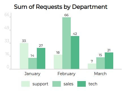
You can also render as stacked bars, add a link to your sources, vertically align labels, and much more:
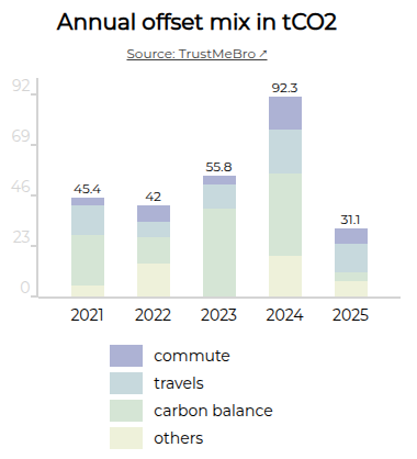
This component is lightweight, written with TypeScript, and is thoroughly tested.
It is available as UMD (CJS + AMD), ESM and TS module format.
mj-chart
Displays charts as images in your email.
Thanks to image-charts for their contribution with this component. It's available on Github and NPM.
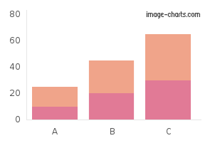
mj-chartjs
Displays Chart.js charts as images in your email. Chart.js is an open-source Javascript charting library.
It’s available on Github and NPM. By default, it uses the open-source QuickChart API for chart rendering.
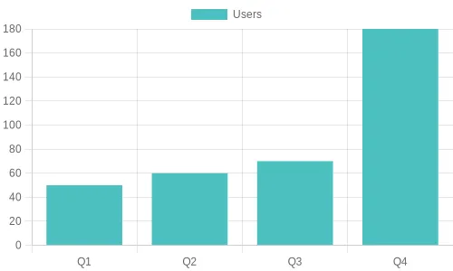
mj-qr-code
Displays QR codes in your email. It's available on Github and NPM.
By default, it uses the open-source QuickChart QR code API.

mjml-msobutton
A button that uses the VML solution for radius, which is supported in Outlook desktop
It uses the same attributes as the standard mj-button but includes three additional ones:
| attribute | accepts | description | default value |
|---|---|---|---|
| mso-proof | boolean | Active the bulletproof mode | false |
| mso-width | px |
The width of the VML solution | 200px |
| mso-height | px |
The height of the VML solution | 40px |
These new attributes allow MJML to generate a “bulletproof button“ which incorporates radius, stroke and alignment, using this method,
It's available on Github and NPM.
Usage
Use it like a standard mj-button:
<mj-msobutton mso-proof="true">Click !</mj-msobutton>
Problems that you should know
- This cannot be used with an image in background
- It creates a duplication of code in the HTML
- The width and the height cannot be used with the auto value.
Sample project on github here
Validating MJML
MJML provides a validation layer that helps you building your email. It can detect if you misplaced or mispelled a MJML component, or if you used any unauthorised attribute on a specific component. It supports 3 levels of validation:
skip: your document is rendered without going through validationsoft: your document will go through validation and is rendered, even if it has errorsstrict: your document is going through validation and is not rendered if it has any error
By default, the level is set to soft.
In CLI
When using the mjml command line, you can add the option -c.validationLevel or --config.validationLevel with the validation level you want.
Set the validation level to
skip(so that the file is not validated) and render the file
mjml --config.validationLevel=skip template.mjml
Alternatively, you can validate the file without rendering by adding the --validate option
mjml --validate template.mjml
In Javascript
In Javascript, you can provide the level through the options parameters on mjml2html. E.g. mjml2html(inputMJML, { validationLevel: 'strict' })
Setting to strict will raise a MJMLValidationError exception. This object has 2 methods:
getErrorsreturns an array of objects withline,message,tagNameas well as aformattedMessagewhich contains theline,messageandtagNameconcatenated in a sentence.getMessagesreturns an array offormattedMessage.
When setting to soft, no exception will be raised. You can get the errors in the object returned by mjml2html. It is the same object returned by getErrors on strict mode.
Creating a Component
One of the great advantages of MJML is that it's component-based. Components abstract complex patterns and can easily be reused. In addition to the standard library of components, it is also possible to create your own components!
We have published a step-by-step guide that explains how to create a custom components with MJML. It will introduce you to the boilerplate repo hosted on Github, which provides a fast way of getting started with developing your own components.
Using MJML in JSON
MJML can not only be used as a markup, but also as a JSON object, very useful for programmatic manipulation or with the MJML API.
With the JSON format, a MJML component is defined as an object with the following properties:
- a
tagNameas astring - a list of attributes as an
object - either a
contentas astringor a list ofchildrentags as anarray.
Exactly like using MJML as a markup, the JSON definition can be passed as an object to the mjml2html function.
Here is working example:
var mjml2html = require('mjml')

console.log(
  mjml2html({
    tagName: 'mjml',
    attributes: {},
    children: [
      {
        tagName: 'mj-body',
        attributes: {},
        children: [
          {
            tagName: 'mj-section',
            attributes: {},
            children: [
              {
                tagName: 'mj-column',
                attributes: {},
                children: [
                  {
                    tagName: 'mj-image',
                    attributes: {
                      width: '100px',
                      src: '/assets/img/logo-small.png',
                    },
                  },
                  {
                    tagName: 'mj-divider',
                    attributes: {
                      'border-color': '#F46E43',
                    },
                  },
                  {
                    tagName: 'mj-text',
                    attributes: {
                      'font-size': '20px',
                      color: '#F45E43',
                      'font-family': 'Helvetica',
                    },
                    content: 'Hello World',
                  },
                ],
              },
            ],
          },
        ],
      },
    ],
  }),
)
Tooling
In order to provide you with the best and most efficient experience using MJML, we've developed some tools to integrate it seamlessly into your development workflow:
Visual Studio Code
Visual Studio Code is a free code editor made by Microsoft. We recommend this package as it is among the most feature-rich MJML plugins for code editors; with live previews, syntax highlighting and linting, as well as export features including HTML and screenshots.
It is available on Github and through the Visual Studio Marketplace.
Sublime Text
Sublime Text is a powerful text editor. We’ve provided you with a package to color MJML tags.
It is available on Github and through the Sublime Package Control.
Gulp
Gulp is a tool designed to help you automate and enhance your workflow. Our plugin enables you to plug the MJML translation engine into your workflow, helping you to streamline your development workflow.
It is available here on Github.
Community Contributions
The MJML ecosystem has a dedicated community that we count to help make it grow and provide it with even more awesome tools, always aiming to make development with MJML an efficient and fun process!
Getting involved is really easy. If you want to contribute, feel free to open an issue or submit a pull-request!
Here are some tools that utilise MJML:
Mailjet
Mailjet offers an integrated MJML workspace designed for creating, previewing, and managing email templates. Its MJML editor supports syntax highlighting, live preview, and validation, helping you move quickly while keeping your markup in good shape.
The drag-and-drop editor in Mailjet is also built on MJML, so visually created templates share the same responsive structure as those coded by hand.
When your template is ready, you can export it in MJML or HTML, or send emails directly through Mailjet.
Parcel
Parcel is the code editor built for email. This feature packed tool includes syntax highlighting, Emmet, inline documentation, autocomplete, live preview, screenshots, and full MJML, CSS, and HTML validation.
Use Focus Mode to keep the preview aligned with the code you're working on, or Inspect Element to easily find the code that produces specific elements in the preview.
Export MJML to HTML with a click.
IntelliJ IDEA Plugin - MJML Support
IntelliJ IDEA is an IDE developed by JetBrains. The plugin provides you with a (near) realtime preview, auto complete, inline documentation and code analysis.
It is available on the JetBrains Marketplace.
Gradle Plugin - MJML Compilation
Gradle is a build tool for a various set of languages and environments. The plugin provides an easy way to embed your MJML templates to your Java/Kotlin application in its resources in precompiled form (HTML).
It is available through the gradle plugin system io.freefair.mjml.java and documentation is available here FreeFair User Guide.
Neos CMS
Neos CMS is a content management system that combines structured content with application. This package adds the helper for compiling MJML markup as well as some prototypes which allow you to use TailwindCSS like classes in your MJML markup.
It is available on packagist.
Easy-email
Easy-email drag-and-drop email editor based on MJML. Transform structured JSON data into HTML that’s compatible with major email clients.
Email Love
The Email Love Figma plugin takes the headache out of the email development process by enabling you to export responsive, production-ready email HTML or MJML directly from Figma.
